Also see: Best Black Friday Tablet Deals Read next: Huawei Mate 9 review
Huawei MediaPad M3 review: Price and where to buy
At the time of writing, the MediaPad M3 is not yet on sale. It’ll be available in selected regions, including the UK, from 26 September 2016. The UK pricing is not yet confirmed, but the base model (32GB Wi-Fi only) €349, which is roughly £290. The iPad mini 4, for comparison, currently starts at 16GB Wi-Fi only for £319. The 32GB model with LTE is €399, which is the same price you’ll pay for the 64GB Wi-Fi only model. The highest priced MediaPad is €449, which gets you 64GB and LTE. We’ll update this page as soon as UK pricing is confirmed, along with where you can buy.
Huawei MediaPad M3 review: Design and build
This tablet is the follow up to Huawei’s MediaPad M2 10.0, and the most obvious design change the orientation from landscape to portrait. As the name suggests, it was a 10in tablet. The new MediaPad M3 scales things down to 8.4in along with becoming portrait in design. This makes the M3 feel distinctly thin, almost like a huge smartphone to look at and hold. When compared with an iPad mini 4, its screen is taller and its bezels pleasingly thin. The MediaPad M3 is a tad thicker than that 6.1mm iPad, coming in at 7.3mm – barely noticeable.
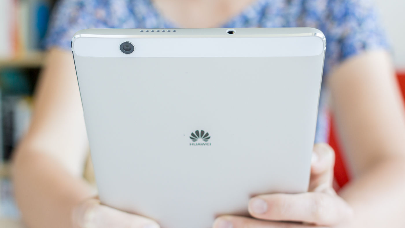
There’s no denying the MediaPad M3 is a beautiful piece of kit. It has diamond-cut chamfered edges, and the same curvature and finish as some of the company’s flagship smartphones like the Huawei P9. Now that the M3 is portrait to naturally hold, there’s a front facing camera at the top and a fingerprint scanner/home button at the bottom. The tablet loses the four speaker grills of the MediaPad M2, instead having two; one each on the top and bottom edges of the device. They are, like on the M2, manufactured by Huawei’s audio partner Harman Kardon. They still manage to pump out audio at a decent level, but it’s what you’d expect from a tablet. For long video viewing sessions, reach for some headphones. On that bottom edge of our review sample was also a microphone, micro-USB port for charging and data transfer as well as a SIM card slot if you fancy a cellular plan. The headphone jack is located on the top while the rear of the device is a clean silver sheen, with an iPhone-esque aerial line at the bottom, subtle Huawei logo and a white aerial strip at the top that also houses the camera sensor. The left edge is completely clean, while the right has a subtle volume rocker just above the power/lock button. Overall we reckon Huawei has done a great job with the design of the MediaPad M3. Portrait orientation makes sense on an 8.4in device, and most tablets designed landscape make sense if used with a keyboard. You can hold the MediaPad M3 with one hand – just – but there won’t be much you can do other than read an e-book. At 310g you’ll probably be using it two-handed for all tasks. It’s not a complete iPad clone – which is good – but the screen is perhaps a sliver too tall rather than wide. We can imagine the MediaPad M3 as a to-die-for 5.5in smartphone, but as an 8.4in tablet, the dimensions are just a tiny bit off. Only just.
Huawei MediaPad M3 review: Display
The display of the MediaPad M3 is excellent, boasting a full-HD 2560 x 1600 resolution with 359 pixels per inch. While the design of a tablet is first port of call for impressions of premium quality, it has to be married with the software and how the screen displays it all. Thankfully the MediaPad M3 is well prepared to deliver the media its name promises.
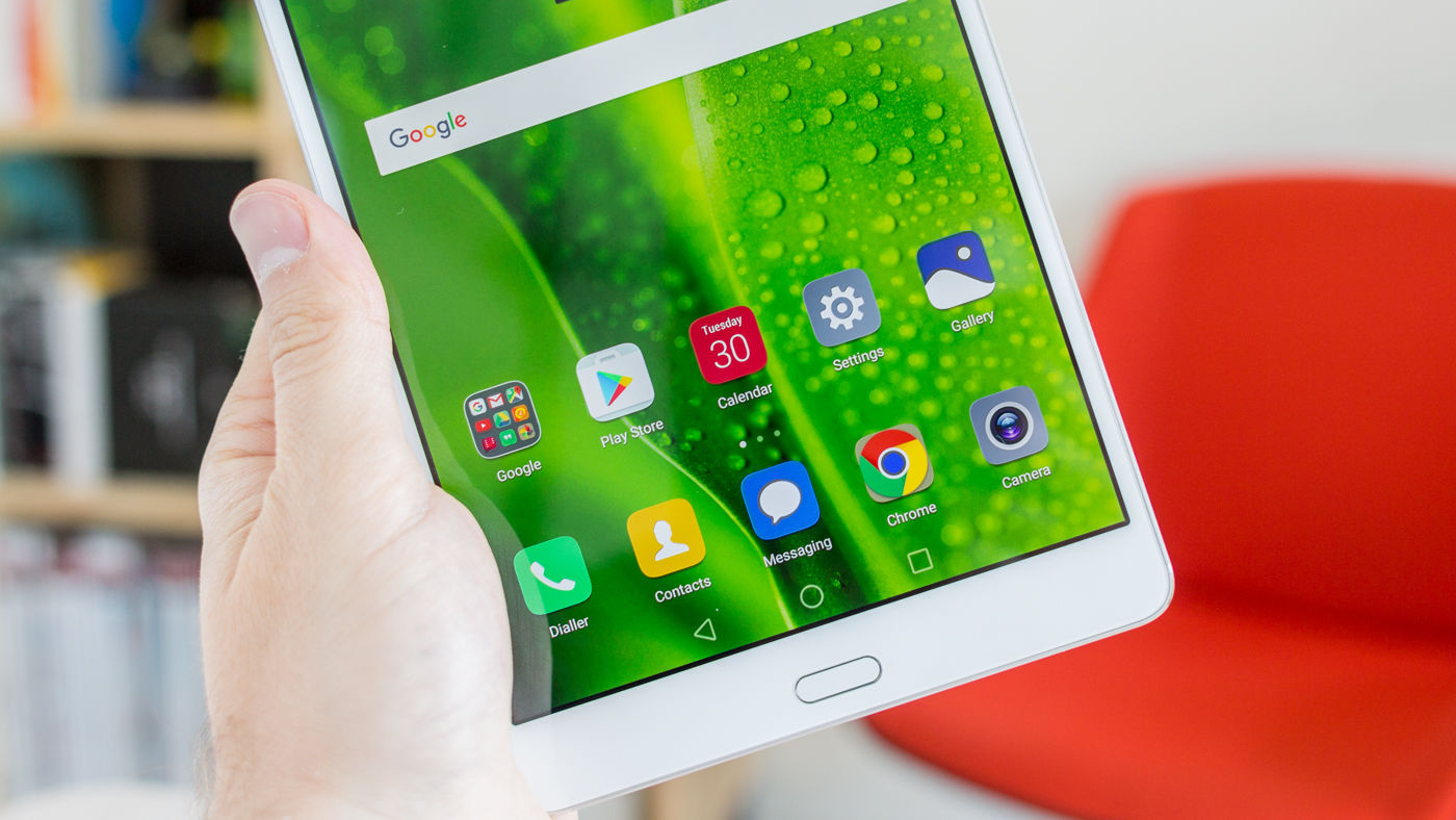
Colours and app icons pop nicely; it’s a pleasure to zip around Android Marshmallow. If anything, the backlight could be a tad brighter, particularly during the day, but we are nit picking slightly. However, next to an iPad Air (first generation), the whites on full brightness are crisper and clearer on the MediaPad M3, though arguably not quite as natural. There’s also an ‘eye protection’ mode, something akin to Apple’s Night Shift but less refined. You can toggle it on and off manually via the pull down shortcut tray, and you may want to use it if reading in the dark, but otherwise it’s a bit gimmicky. Games like Asphalt 8 look amazing, while video playback is as smooth as you’d expect from Huawei’s Kirin CPU on its latest flagship tablet. The display more than holds it own here compared to rival devices like the iPad mini 4 or the Samsung Galaxy Tab S2.
Huawei MediaPad M3 review: Specs and benchmarks
As mentioned, the MediaPad M3 is rocking a Huawei-made Kirin 950 processor, paired with a respectable 4GB RAM. Our LTE model came with 32GB of on-board, non expandable storage which may not be enough – there’s luckily a 64GB version, which is more reasonable, but costs €449, €50 more than the 32GB model with LTE. There’s also a slot that takes a nano SIM, but remember you can get a Wi-Fi only version if you prefer. It also takes a micro SD card for expandable storage up to 128GB. At 8.4in, the MediaPad M3 is a good size if you’re after a tablet to use with a data plan as it’s compact and light enough to carry around all day, stuffed full of your favourite music and films.
The MediaPad M3 did very well in our standard benchmark tests. It scored an immense 5060 in Geekbench 4’s multi-core benchmark score. The iPad Air 2 (admittedly a two year old tablet) scored 4643, while the iPad mini 4 scored 3108. The M3 is actually not far behind the iPad Pro 9.7in that scored 5257. On paper, Huawei has produced a lightning quick tablet. In actuality, it can perform noticeably slow, but only in highly intense games such as Asphalt 8, where gameplay occasionally lagged. For most users however, the MediaPad will be completely adequate for all tasks. Video playback is buttery smooth, and 8.4in is a great size for throwing in a bag for the bus or even a long plane ride; videos look amazing on it.
Huawei MediaPad M3 review: Cameras
We’re still firmly in the ‘never take a photo with a tablet’ camp, but if you are truly forced to, then luckily the MediaPad M3 is up to the task. It has a 8Mp main camera that produces pleasingly crisp, defined images.
The front facing camera is the one you’ll probably use most for video calling (and those quintessential selfie sessions, some of you. There’s no shame in it). Huawei has put some quirky but largely useless functions on this camera’s software, such as a beautifying mode where you can make your eyes bigger and your skin whiter. It’s pretty odd.
Obviously this isn’t an iPad, so there’s no FaceTime, but if you’ve got a SIM card then you can use Google Duo, which is excellent. Failing that, Google other video service Hangouts works well, as does Skype. The MediaPad has no problems keeping up with these types of calls as long as you have a decent Wi-Fi connection.
Huawei MediaPad M3 review: Software
The MediaPad M3 landed on our desk with Android Lollipop 5.1. We had to manually update to Marshmallow 6.0, but hopefully the final product will ship with 6.0 given it has been out for several months now (the press materials state it ships with 6.0). Also, when we updated, we were presented with the screen below, complete with Chinese script. Again, hopefully this won’t feature on the final English language release as we could read what the update even was.
Huawei’s EMUI (Emotion user interface) overlay of Android isn’t unattractive, but we feel it’s actually slightly less eye-catching than stock Android. The MediaPad ships with version 4.1, and it’s a solid user experience. Icons are fairly plain and have muted tones. It’s still easy to flick around, but features such as the notification tray aren’t as intuitive or easy on the eye as stock Android, or even rival Samsung’s lately improved TouchWiz overlay. If you’re used to either of those OS, EMUI will take a few hours to get your head around. There are no sign up offers here for additional cloud storage unlike on some other tablets where manufacturers partner with Microsoft or Google to offer OneDrive or Drive upgrades. Overall for casual use, which after all is what this tablet is for, the EMUI OS won’t hinder your enjoyment of it. That might not sound like a glowing endorsement, but while this is a fine tablet to use, it’s important to note that we aren’t totally blown away by the experience. One cool thing that works well with the software and improves use is the fingerprint scanner. Also a home button, there are integrated touch gestures that, once learned, improve day to day use. Where most tablets’ home buttons simply take you back to the home screen when pressed, the MediaPad M3’s takes you back one page or step if tapped once. It’s not a physical button, and you end up using it like the Android back button (which is still displayed just above the button on-screen).
Hold down your finger on the button (which doesn’t physically move) and the tablet vibrates a tad, showing you’ve full-pressed and it whisks you back to the home screen. The other function is handy too; swipe over the pill shaped button from left to right or vice versa, and it brings up your open apps. This means you can use the one home button for all Android’s usual function buttons. It’s very good indeed and it makes you wonder why it isn’t standard on tons of Android devices already. Henry is Tech Advisor’s Phones Editor, ensuring he and the team covers and reviews every smartphone worth knowing about for readers and viewers all over the world. He spends a lot of time moving between different handsets and shouting at WhatsApp to support multiple devices at once.


