It’s easy to get caught up in the creative aspects when building your website; uploading enticing pictures, ensuring the colours are just right and writing catchy content, among other things. So by the time it comes to completing the contact page, it’s no surprise that many people just slap in a Google map, jot down their address and leave it at that. This is a mistake. Considering that this is where your visitors decide whether or not to get in touch with you, so it’s worth investing time and energy to get it spot on. An effective contact page has three basic rules: Use the 6 tips below, selecting those appropriate for your audience, to invite communication to your Contact Us page.
Show Your Location with a Physical Address & Map People want to know that there is a physical company behind the website and, typically, where it’s located. It shows that you have a base, are rooted in the real world and it adds an extra level of trust and legitimacy to your business. If you don’t have a fixed office or address that you want to share, then consider using a virtual office or a mailbox number. Most website builders, including Wix.com make it easy to embed an interactive map.
Time to Pick up the Phone Letting customers have that personal contact with you over the phone is an important step in client engagement and trust. Not showing a phone number may look like you have something to hide. If you want to go the extra mile then consider creating a freephone number for your business. Also, adding a Skype call button is a good option for those who have international clients.
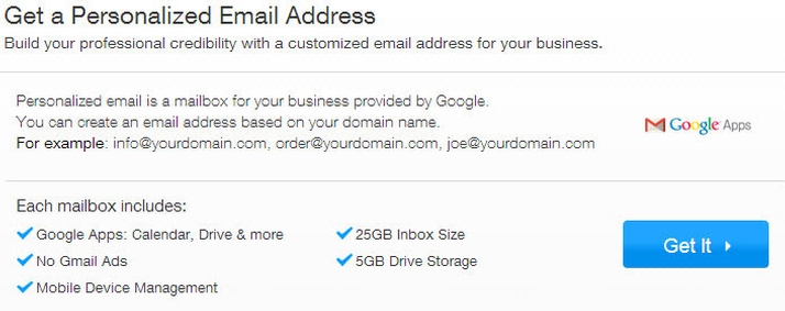
Create & Add a Business Email Address Some people are shy to pick up the phone or simply prefer to leave a paper trail behind them. Including your email address lets them communicate with you at a distance and at their own pace. Show that that you’re a professional by using a business email address i.e. yourname@yourbrandname.com instead of yourname@gmail.com. You’ll make a better first impression and your business will look more established and credible. Usually, you’ll get email addresses included when you buy your own personalised domain name, but you can also go down the Google Apps route, which means you can use Gmail but with your domain name after the @ symbol instead of Gmail. 4) Create a Contact Form Email is great for some while many people find a contact form the easiest, fastest and most accessible form of communication. People like choice when it comes to communicating, so the more methods you have for them to message you, the more you’ll improve communication with your business. Plus you’ll learn about your customers’ preferences. If at all possible, offer live chat to give potential customers an immediate way to get answers.
Include Social Media Links These days people use Facebook, Google+ and other social channels as frequently as they do email, so you’re missing a trick if you’re not connecting with your website visitors in this way. Adding social links will show that you’re willing to engage in more open forms of communication and as mentioned above, the more “touch points” you have for your business, the better. 6) Give your Site the Personal Touch Once all of your elements are in place on your contact page, think of a message to add that reflects your brand. Include imagery that echoes the rest of your website and is in tone with what you represent. Adding something that shows your company’s personality will give a sense of familiarity and instant rapport and by keeping the flow smooth, it will make the action of contacting you a natural choice.


